Research
Magazine covers I like

Figure 1
The masthead of this magazine cover is in the top left corner, which is good because that's the first thing an individual sees in a store, attracting them and giving them interest in the magazine. This was published by i-D, a magazine that contains fashion, music, art, and youth culture. Therefore, the audience is aimed at teenagers and young adults of around 16-24 as they typically lean towards fashion, makeup, gossip, etc on social media. Whereas, older adults are typically more interested in the news or different types of magazines like travel or interior design. Terry Jones, a former designer and Vogue art director, introduced i-D in 1980 and since then there have been nine other editors of this magazine. Lineisy Montero is on the cover of 'The New Luxury' issue 342, which was published in the spring of 2016 with Harley Weir as the photographer. The gender audience of i-D magazines are for women due to what is included in them. For example, in this issue fashion and catwalks are being discussed which typically a male would not particularly enjoy reading. Moreover, this issue shows that i-D magazines include people of different ethnicities and nationalities as Lineisy Montero is from the Dominican Republic. This cover attracts individuals because the model is looking directly at the camera, therefore the eye contact makes it informal meaning it speaks directly to the reader. Additionally, the masthead is in the shape of a winky face which contributes to the aim of the age group.
The masthead of this magazine cover is in the top left corner, which is good because that's the first thing an individual sees in a store, attracting them and giving them interest in the magazine. This was published by i-D, a magazine that contains fashion, music, art, and youth culture. Therefore, the audience is aimed at teenagers and young adults of around 16-24 as they typically lean towards fashion, makeup, gossip, etc on social media. Whereas, older adults are typically more interested in the news or different types of magazines like travel or interior design. Terry Jones, a former designer and Vogue art director, introduced i-D in 1980 and since then there have been nine other editors of this magazine. Lineisy Montero is on the cover of 'The New Luxury' issue 342, which was published in the spring of 2016 with Harley Weir as the photographer. The gender audience of i-D magazines are for women due to what is included in them. For example, in this issue fashion and catwalks are being discussed which typically a male would not particularly enjoy reading. Moreover, this issue shows that i-D magazines include people of different ethnicities and nationalities as Lineisy Montero is from the Dominican Republic. This cover attracts individuals because the model is looking directly at the camera, therefore the eye contact makes it informal meaning it speaks directly to the reader. Additionally, the masthead is in the shape of a winky face which contributes to the aim of the age group.

Figure 2
This magazine has an audience of young and/or older adults rather than teenagers because the cover is showing the actress Gal Gadot, who has two children, therefore mothers can relate to this as it may contain tips on how to maintain 'pretty' in the social world, due to the caption "Beauty Queen." Moreover, the gender audience for this is women as I feel this cover portrays women empowerment. This is due to the caption of "Real-life Wonder Woman," referencing the movie 'Wonder Woman' that the actress was starring in. Woman empowerment is also achieved by the way Gal Gadot is posing as she is showing off her body by the use of confident body language. In additional detail, her pose makes the photo balanced. The confident body language is conveyed by the eye contact as she is looking directly at the camera which speaks directly to the reader/viewer. This therefore portrays confidence, opposite to if she was not looking at the camera and covering her face, which would convey self-consciousness. Another reason that the gender audience is women is because the cover lines below the sub-title read "5 minute party hair" and "Holiday Shopping? Done. 74 Amazing Gift Ideas" These cover lines attract women more as they stereotypically go shopping and read hair and beauty tips more rather than men. Also, they provide guidance on how to look and behave which is generally in women's magazines. I think mothers could relate to this cover because Gal Gadot, a mother of two, would inspire mothers that you can still achieve your dreams and it portrays that mothers are powerful. This is shown by the cover lines that list a number of roles that the actress is. "Beauty queen, combat instructor, real-life wonder woman." The colour scheme is quite neutral with the use of black, grey and white tones. This lets the audience focus more on the model rather than the background opposed to if it was a bright colour as that would in that case distract the viewer. For example, the background is grey which looks dull behind black clothing and white text. The layout of this magazine cover is slightly different than other covers because most typical women's magazines contain cover lines with tips at the sides of the magazine and would look quite busy, whereas this one is fairly minimalist as it doesn't look very cluttered with a sub-title and a few cover lines. The masthead is at the top which is where it typically is. The 'E' of 'ELLE' is in front of the models wrist, opposed to the model covering the rest of the masthead. This is so that the first letter is visible to an individual in order for it to stand out in a store and catch someones attention. Lastly, the mode of address is informal so that the friendly and chatty tone speaks directly to the reader. The publisher of ELLE magazine is Kevin C. O'Malley.
Magazine covers I like and will use as my research and for my planning
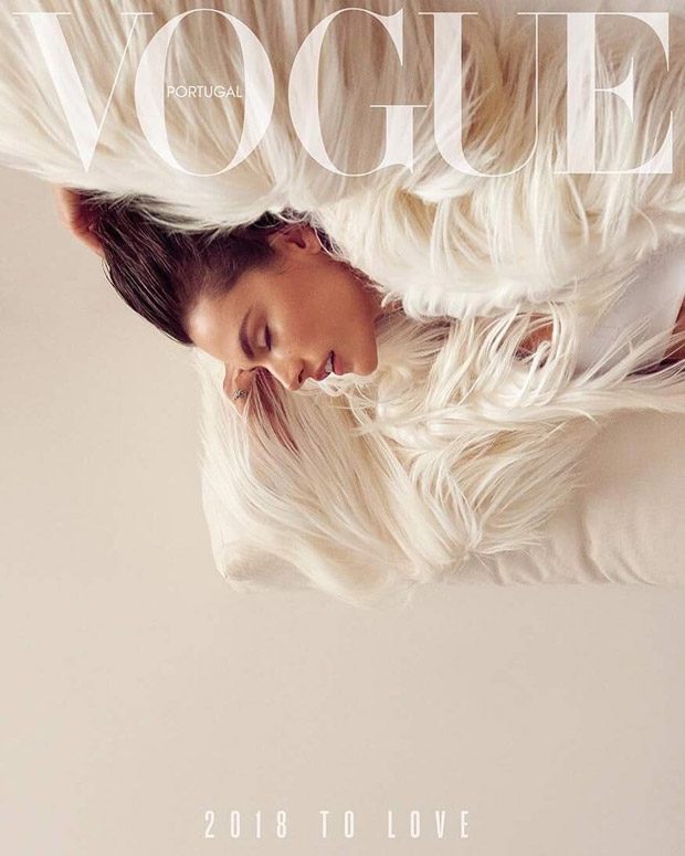
The publisher of this magazine cover is Sofia Lucas, with Alessandro Ambrosio as the model. The minimalist theme of this makes the viewers concentrate more on the photograph and the layout, in addition to focusing on the fashion. This is a winter magazine for many reasons. Firstly, this is due to the date of this issue; January. Secondly, the pattern of the winter fluffy coats in the editorial convey warmth, and the light colours demonstrate a joyous mood, which winter generally associates with, opposed to linking with darker colours. The masthead is at the top and has a big font to stand out. It's also white to match with the colour scheme. If it was for example red, it would clash with the rest of the colours and distract the viewer. The main cover line "2018 to love," is at the bottom of the magazine with a simple font to make this minimalist and aesthetically pleasing. This further provides a positive atmosphere of the magazine. I like that there is a specific colour theme instead of using multiple different colours that would make it very busy and confusing. The age group that this is aimed at is 18-26 because it concentrates more on the fashion. This is due to the minimal use of text. Moreover, this is aimed at a gender audience of women because the cover is feminine due to the light colours, and the word "love."

I like the comparison of the colours on this cover because the black background makes the pink dress stand out for the viewers, making them focus more on the model and the fashion. I like the simplicity of the colours as using only three (black, white and pink) is less busy and doesn't confuse or distract the viewers. The sub-title is clear and simple, standing out on the dress easily for the readers. It is in a big and bold font to catch the viewers attentions. Moreover, I like that a cover line is a reference to a series, for example "Milly Bobby Brown no stranger to fame." This is referencing the popular series 'Stranger Things' that the actress stars in. Seeing this on the cover, it would make certain viewers excited to read the magazine as she is quite popular along with the series. They are also almost promoting it for those who would read the magazine but haven't seen the show. Another thing these cover lines provide are quick fix problems such as, "Summer dressing, how to take the heat." This draws the viewers attentions because this persuades them to buy the magazine. I feel that this is directed more towards women due to the cover lines mentioning only women actresses rather than male actors, therefore the quick fix problem would be answered more for them. Also, the bright pink stereotypically stands out more for women rather than men. This cover is directed towards an age group of young adults because it's bright and fashion-related, however it may also be aimed towards the middle aged older women. This is because Carey Mulligan is on the front cover, an actress and singer who has two children. Therefore, mothers her age could relate to what the actress talks about in the magazine. The publisher of Vogue Australia is Edwina McCann.

This cover is concentrating more on the photograph and fashion part of it due to the minimal use of text. Instead of cover lines, they used a strong and powerful word in the middle to catch the viewers attention. As always, the masthead is kept the same but it is transparent and clear to match with the hat and colour theme of this cover. This is directed towards people who are creative in the photographic field, have a passion for fashion and an eye for aesthetically pleasing photos. The shot type used is a medium close up so that it is focusing on the hat rather than the clothing. As they are not showing the rest of the clothing, they are intriguing viewers to open the magazine to see if there are more photos. The colour scheme is including warm tones like yellows and browns without contrasts. This avoids any distractions or clashes with other colours. From the front cover, I think this is aimed at an age group of 16-25 because young adults and teenagers would appreciate the fashion and high quality photos more than the articles, and due to the word on the cover, it makes it look aesthetically pleasing as well. Additionally, the young 24 year old model would attract the younger viewers because many like to collect fashion magazines. As Barbara Palvin is on the front cover, it would be said that the gender audience is women, but I feel that this appeals to any gender that loves fashion and professional studio photos.

I like this double page spread because it is aesthetically pleasing to look at which would interest the readers and it is quite creative for example, there is a coffee stain to maintain the cafe theme. I like how the small text is clearly separated from the title and the image diagonally which makes it intriguing to look at. There isn't too much text that would bore the readers as the image and title overcomes that. I also like that the title is laid out across the double page spread so there isn't an end to the page or is separated. The font used for the main and sub title is appropriate for the topic because it looks quite posh and classy which portrays the atmosphere of a cafe. The black font is on top of a white background which makes it look clean and precise even with the coffee stains because the stains are placed on there perfectly, and the two tones don't make it look busy which would not confuse the readers. Moreover, the precision of this is demonstrated even further due to the straight lines which almost makes it look geometric. I feel that the gender audience is for both genders because there are no particular colours or topics that would stereotypically attract a specific gender. However, this is aimed at an age group of 25-40. This is due to the topic of coffee/cafe which would attract older adults as teenagers and young children are not generally too keen on coffee. Although, this could attract young adults due to the aesthetic layout and colours of these pages.

Comments
Post a Comment